AMK
Microfinance Loan App

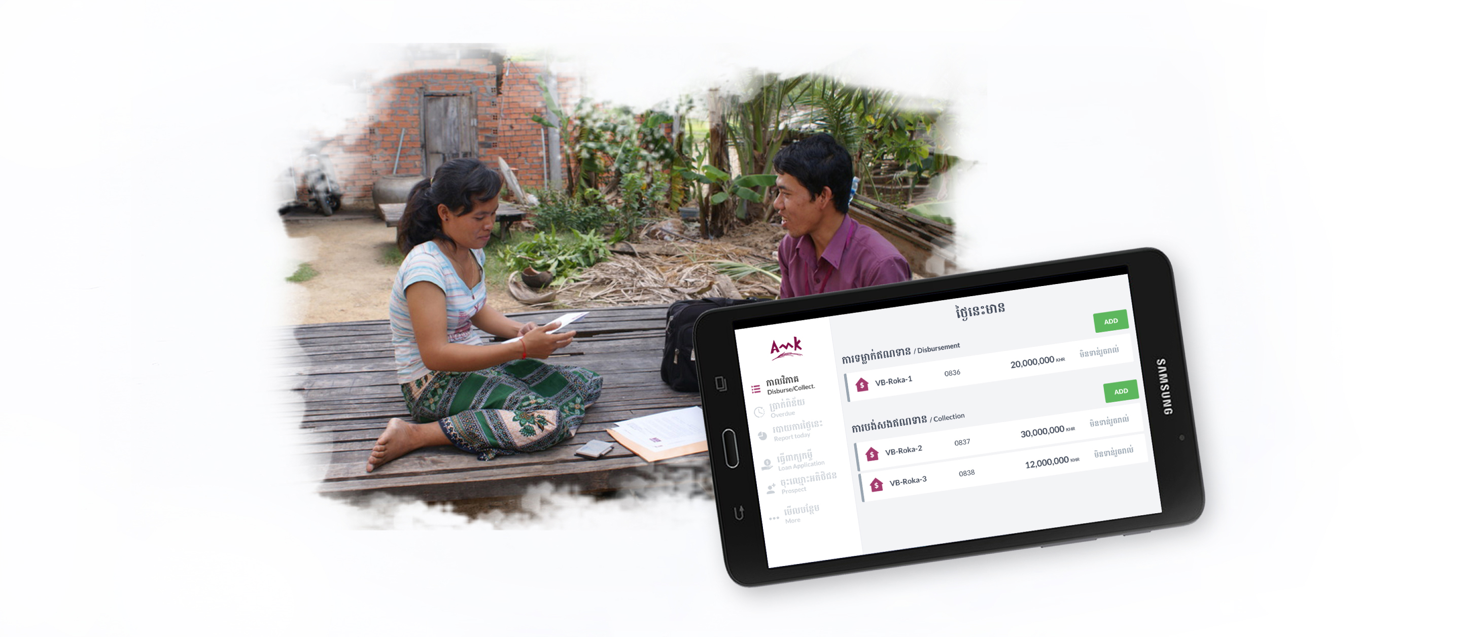
AMK was looking for support to revamp the current Internal Loan Process Tablet App’s user interface and flows. As the app was the core of their business, any changes could possibly mean more business or less...
Design Process

Identifying Need
UX Audit
11 Key flows and 140 screens were audited. Study revealed a variety of problems from low to high severity levels (from 2-3).
When fixed, most of the issues discovered could improve interest in using the service and optimisation of time, no level 4 issue was discovered (that block user from completing a task). The loading time and the fields are the most important aspects and should be given high priority,

Field Observation
The tablet application is used mostly during the morning meeting and during loan application. During loan collection and loan disbursement, the flow is still simpler on paper.

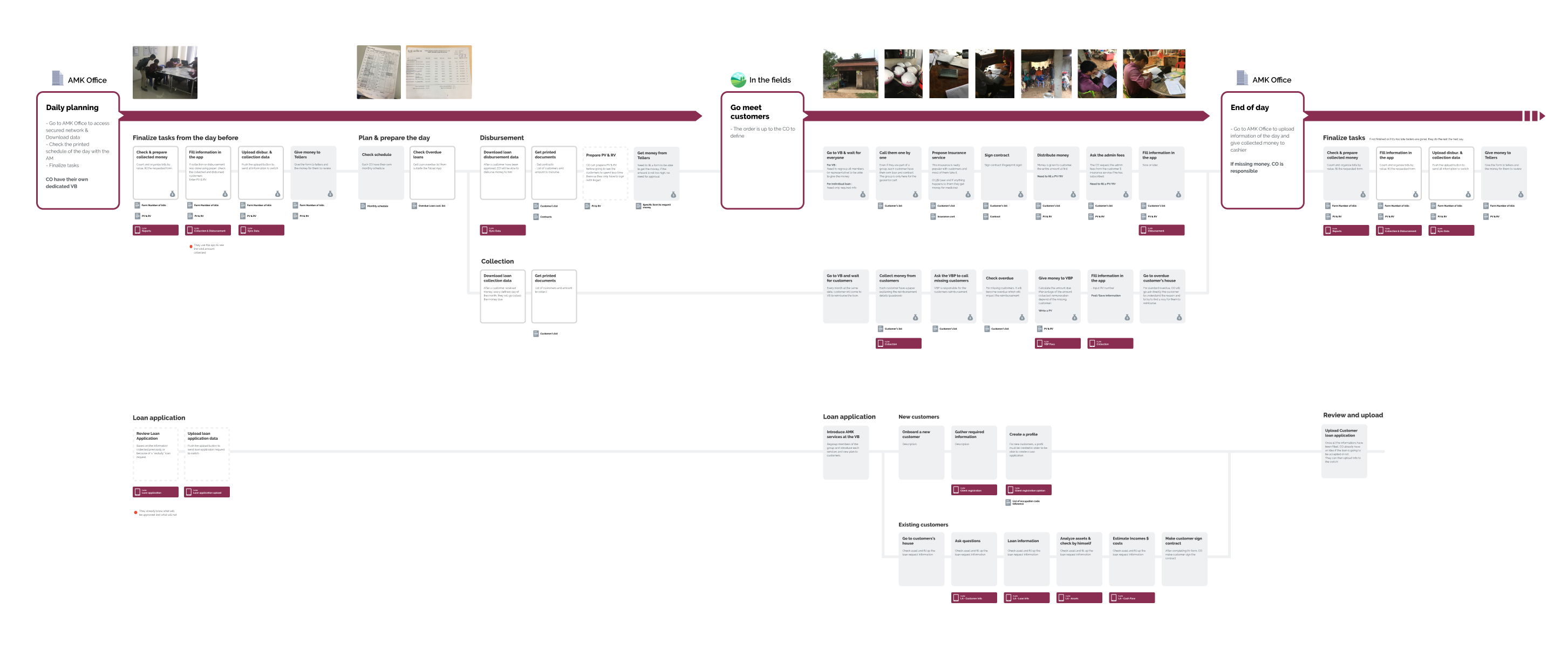
Customer Journey Map
Study the task of a Credit Officer and analyze the needs and pains he encounters.
Problem Space
Problem Space & Opportunities
Time is money
Spending 5 more minutes per customer is an hour lost everyday.
Connected database
Multiple persons need to access/modify/validate data at the same time.
No exception allowed
If a specific case cannot be recorded through the app, CO need to do everything on paper.
Co-creation Workshops
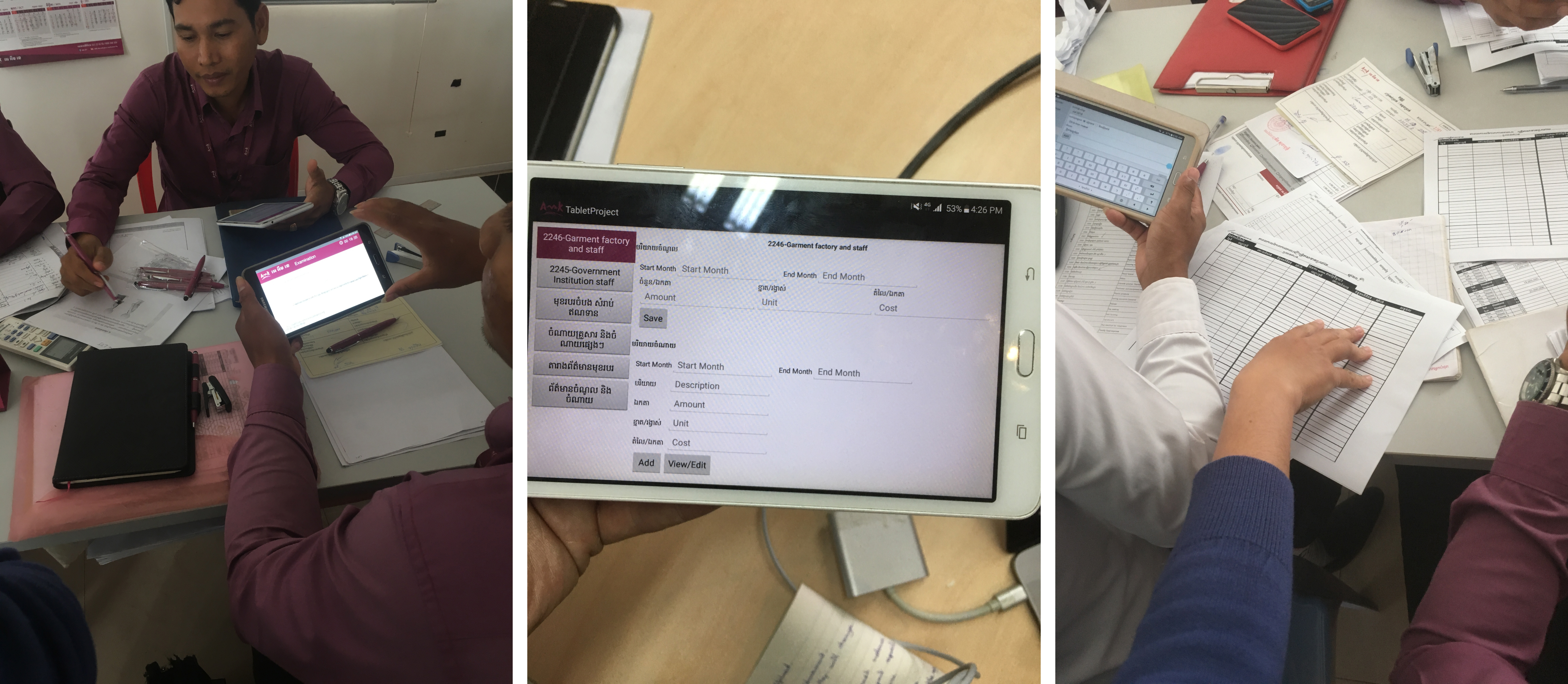
During the co-creation, we spent a lot of time focusing on the time currently required to complete each tasks and if some business/process modifications could be implemented to reduce the time taken.
Solutions
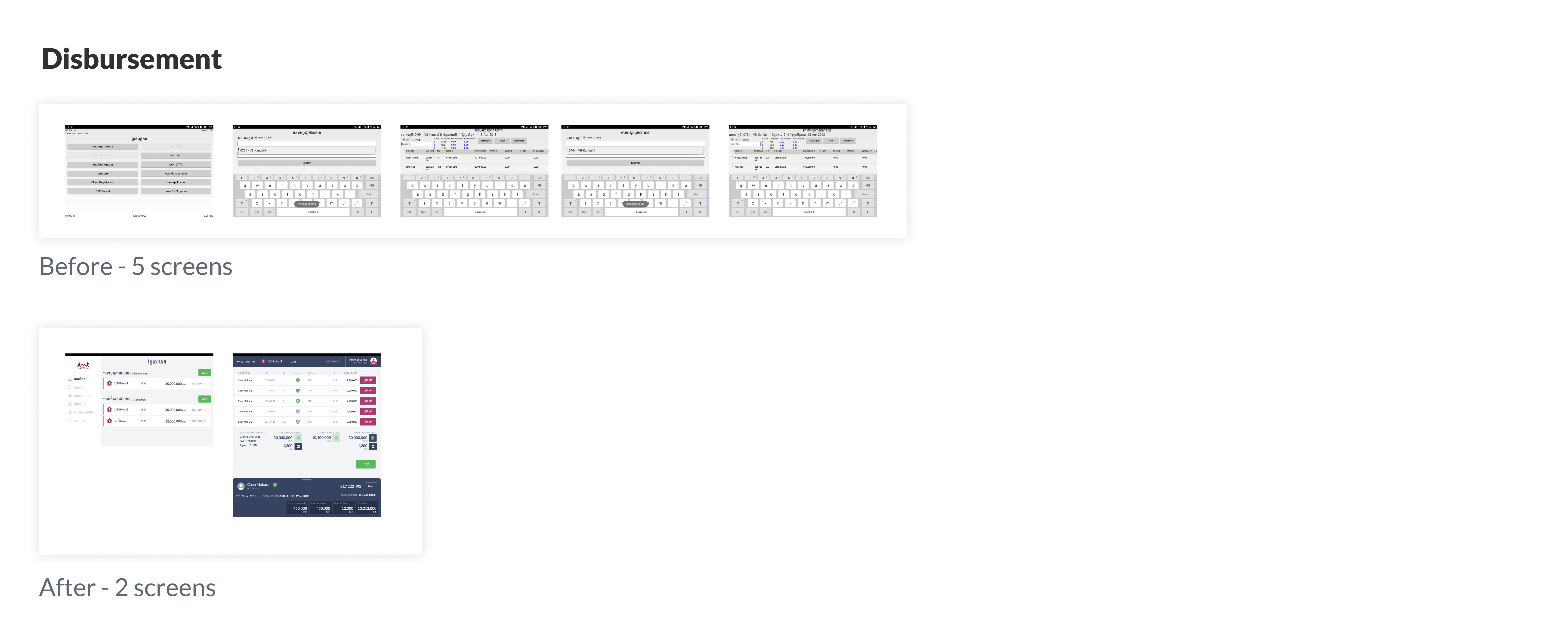
Reducing the number of screens
During our process, we noticed that a lot of tasks that were done manually could be done automatically by the interface. From sorting the element or getting only a specific type of data. Understanding the reason why some information were displayed and what the CO were in need of allowed us to show only the important information during some key flows.

Redesigning the interface
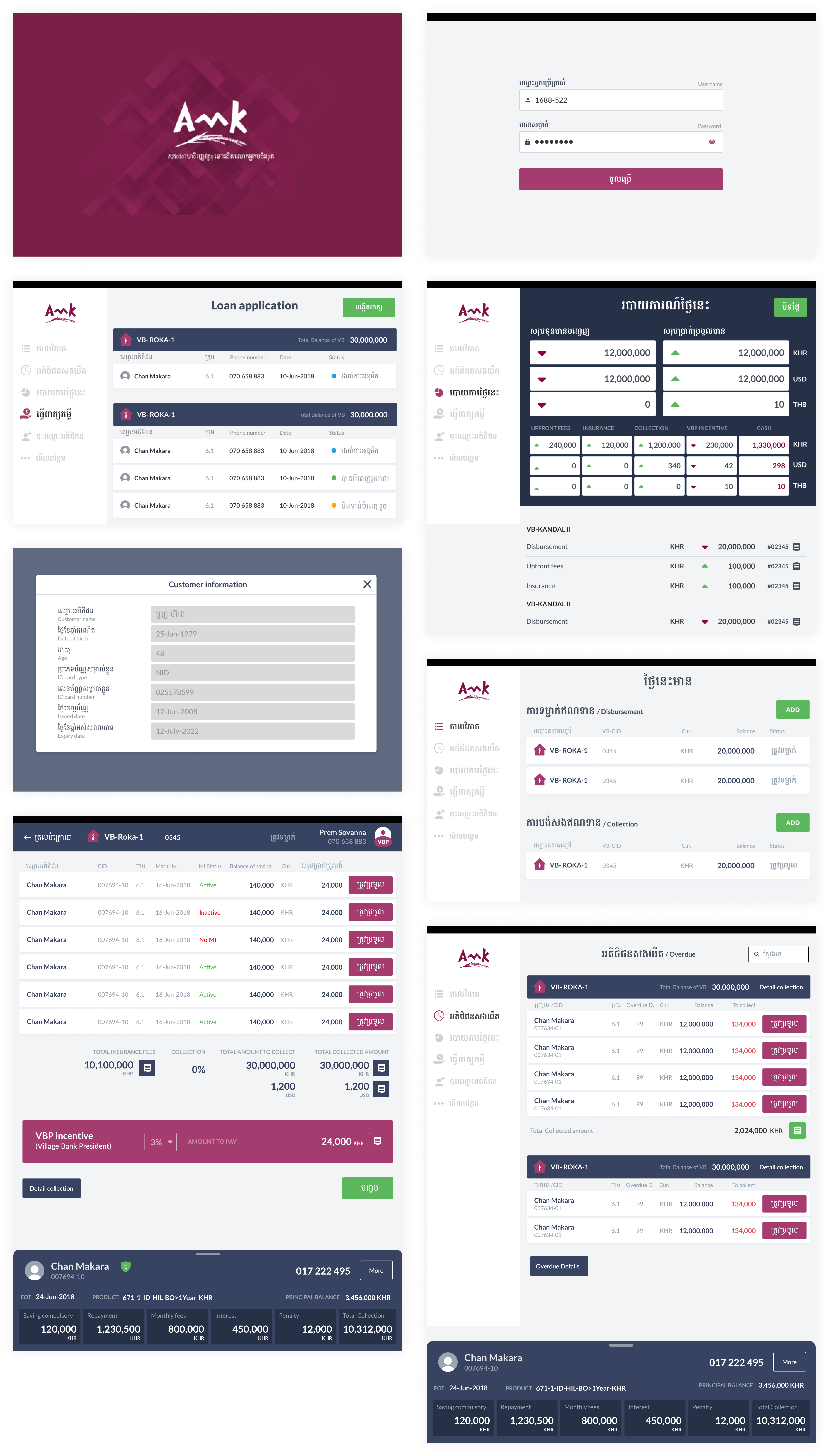
As the content of this app was mostly made of information from a database and the original design was a standard table design, redefining what a table look like allowed us to modify a lot of pages and add some information hierarchy.
This came as a bigger challenge than expected as the number of columns needed was in most cases too important for the screen size. A part of our job was to determine if columns could be removed, modified or even just renammed.

Designing for the exception
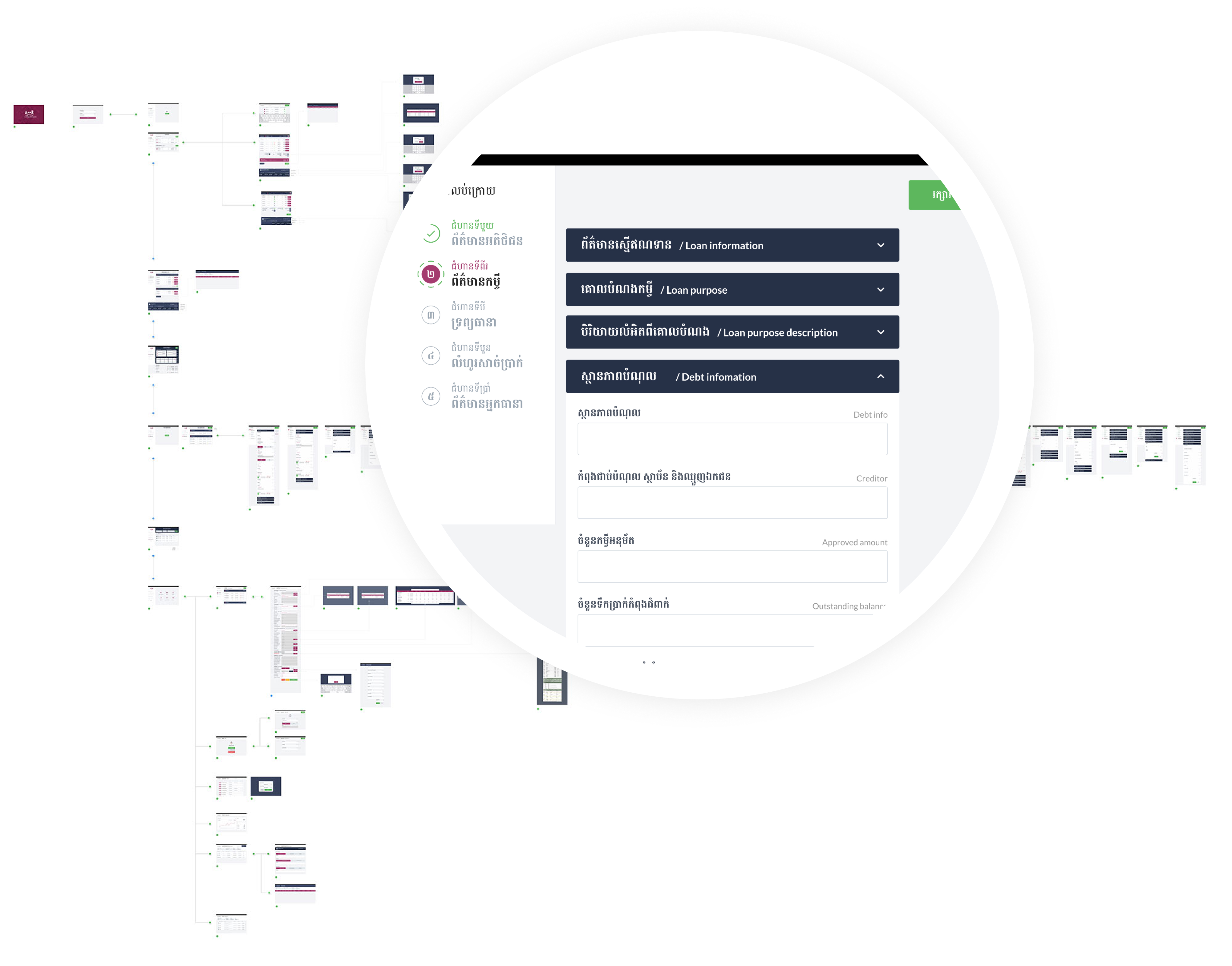
As said previously, all exceptions needed to be considered so that no CO would be needed to switch back to paper. To ensure that, we established weekly workshops with every business units involved with the app. We then made sure that all aspects were taken into account and that changing a screen really had no impacts on other services.
Selected UI
Outcome
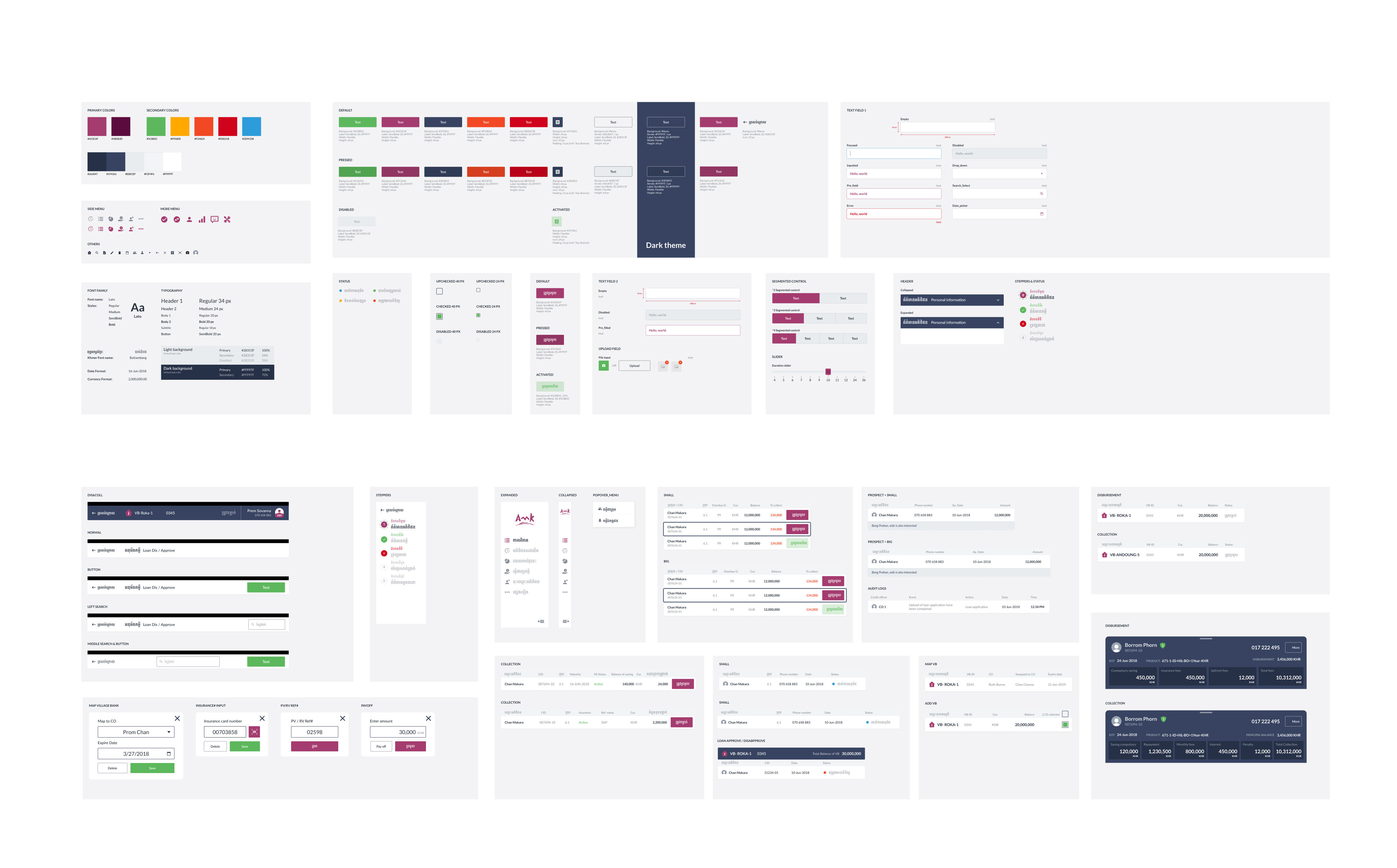
Design System
As our process involved all the teams, we decided to create a design system. They would then be able to use it to develop and ship features more efficiently and form a more cohesive customer journey.
