Aeon Bank
Banking App with QR Code payment

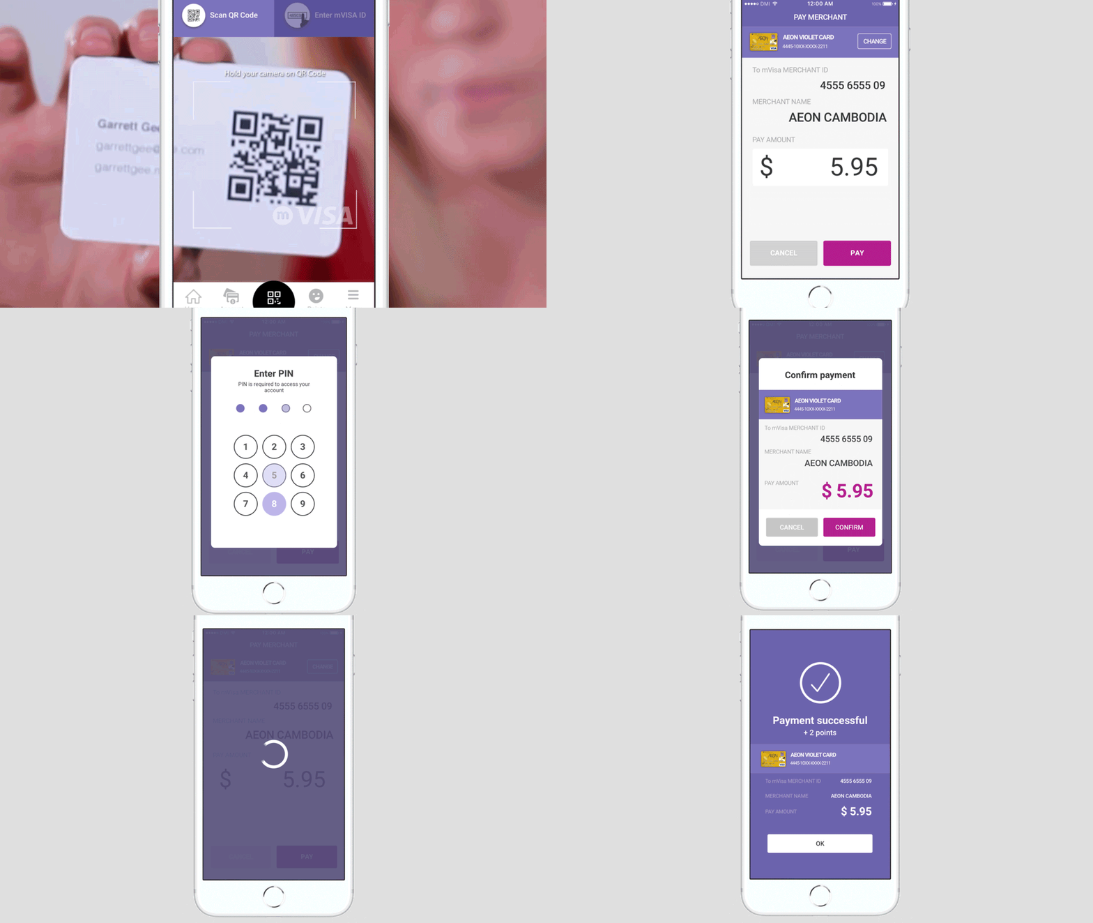
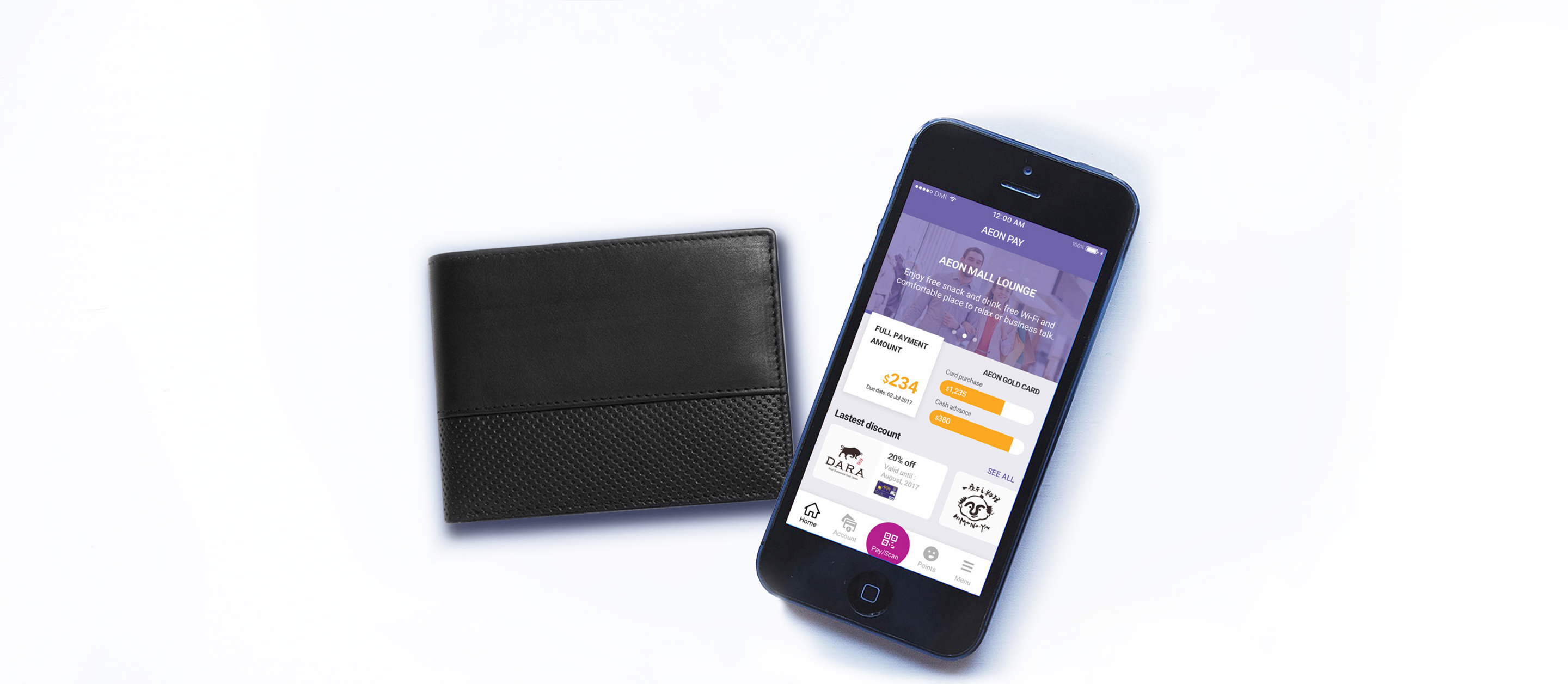
AEON partnered with DMI to improve and test the user experience of their new banking app with QR code payment. The result features some recommendations based on user feedback and new flows emphasizing discounts available when using the service.
Design Process

Identifying Need
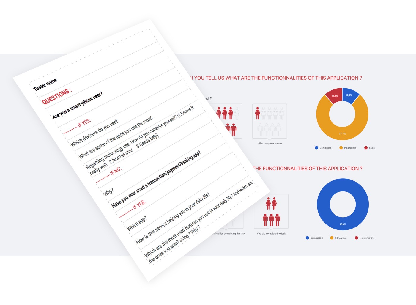
As some screens had already been created, The idea was to test them right away. After review, apart from a few missing screens, the flows were good enough to test.
I created an interactive prototype based on the existing screens to change tester feedback from screens to flows. Doing so, I was able to create what seemed like a real app from non-expert eyes, therefore making the test results more valuable.
Solutions
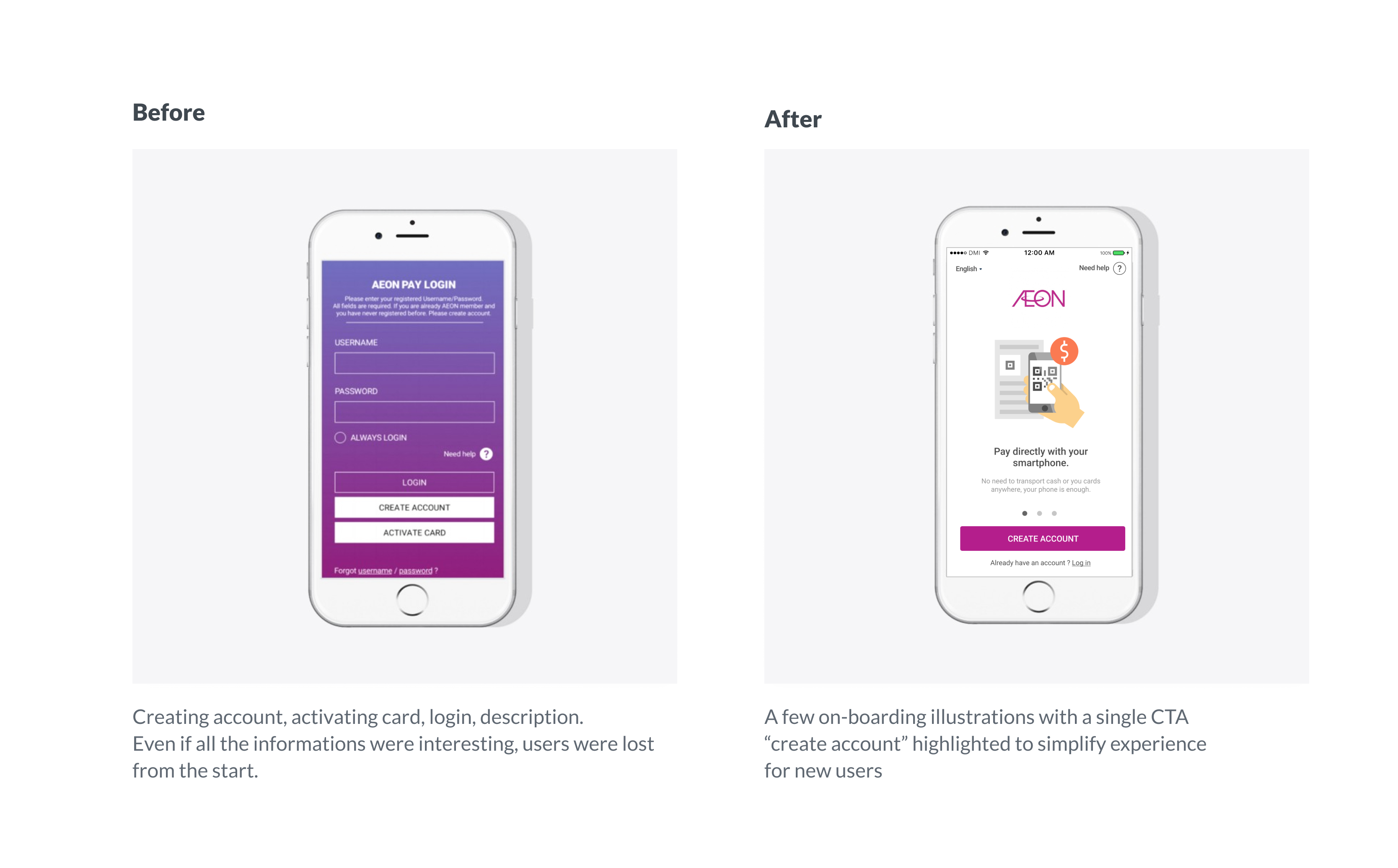
On-boarding screens
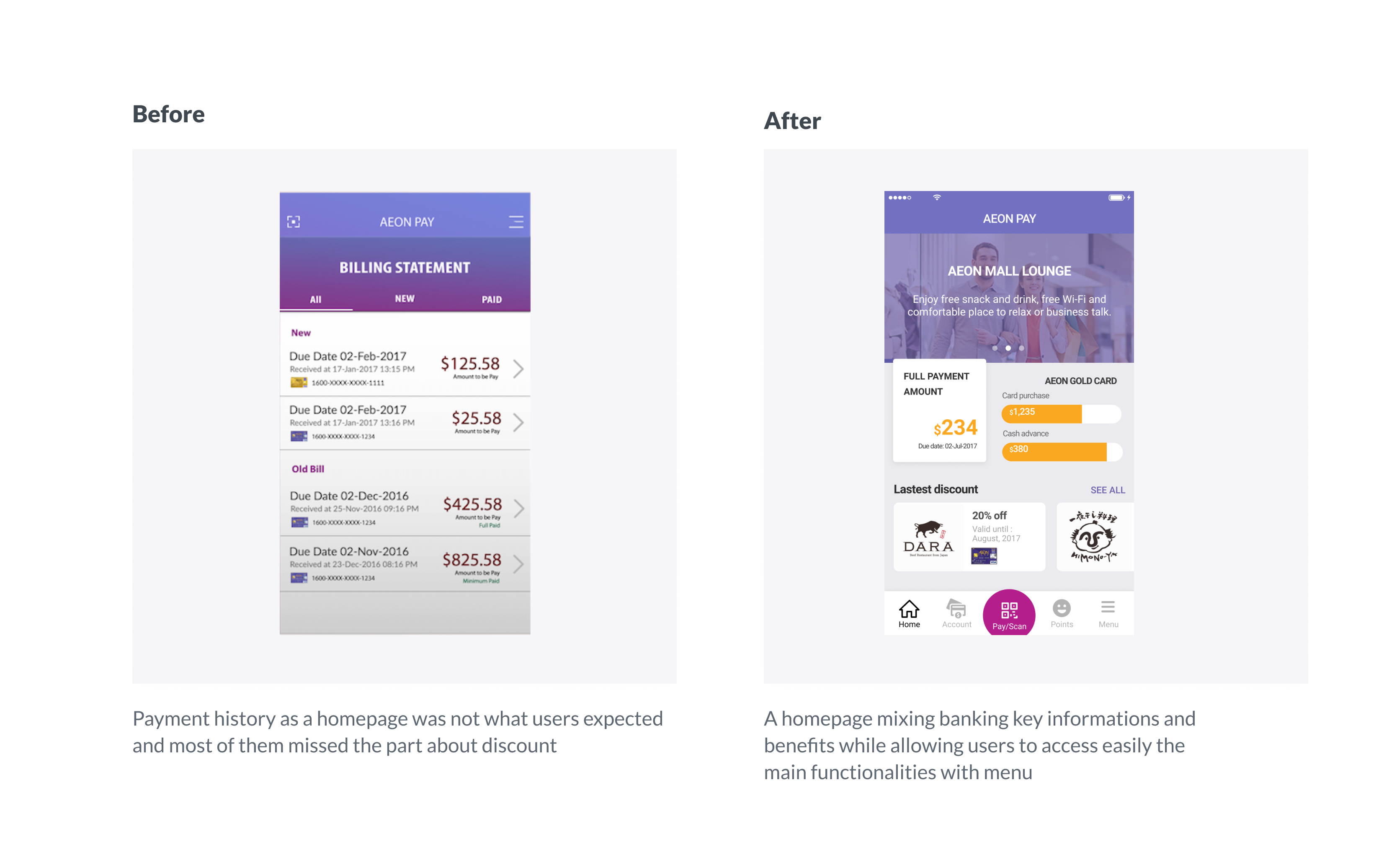
Simplifying the flows and the screens based on user feedback. We chose to highlight discounts as competition in Cambodia was on the rise and other companies were already providing a similar service.
Homepage & Navigation
Having all key informations in the homepage was a must have as only the main feature (QR code scanning) was gonna be used on a daily basis. We decided to make it easily accessible but not on the homepage. Showing users the new benefits would allow the brand to advertise better and to add value to the service.
Deliverables
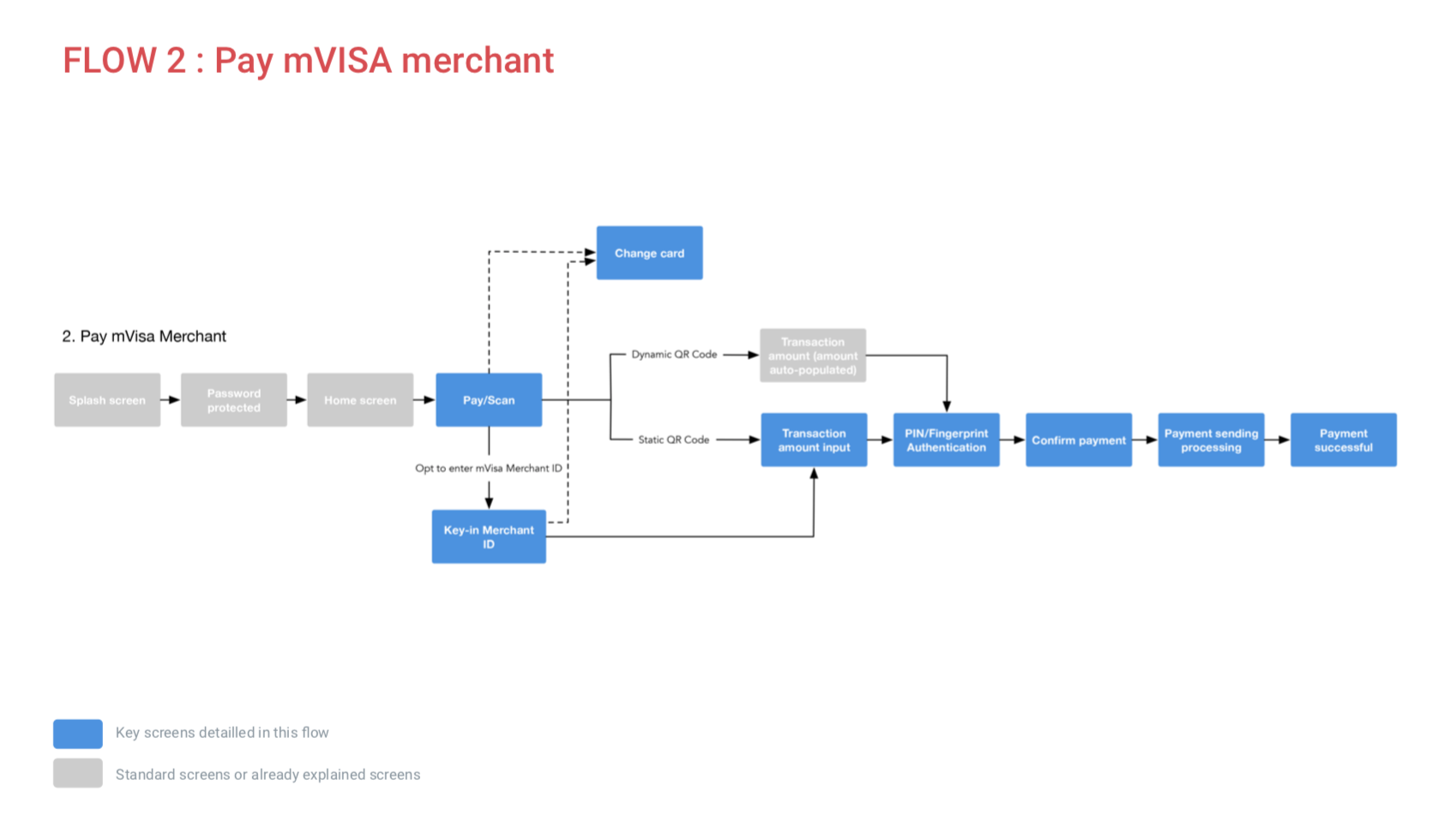
A detailled presentation was part of the deliverables, explaining each flows with screen by screen details enabling developpers to implement the solution.
Animation
